
Ever look at a product and wonder, “why did they design it that way?” I know I have, and I have some examples I want to bring up.
Years ago, over dinner, I had a programmer from our Wisconsin office basically ask, “why the hell is your file system for your web servers setup the way it is?” It was a fair question. It wasn’t something one would normally see. But before I explain that…
Like any modern American, I’m physically incapable of being more than 10′ from a flat screen TV in my house. We have several, including one in my office and one in the kitchen. I couldn’t tell you the brand of the one in the kitchen (well I could, but I’m too lazy to go downstairs and find out) and the only reason I can tell you the brand of the one in my office is because I can see it from here. It’s an Inginsia brand.
Both serve the same function: they allow me to watch TV. But both have design quirks.
Their button layouts are a bit different (note the layout of the numbers and the volume/channel control buttons.)

Kitchen TV Remote
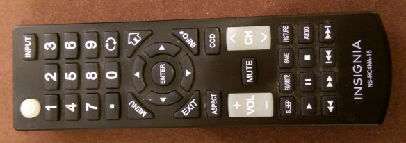
Office TV Remote
The kitchen TV also has a built-in DVD player, so it has additional controls for that.
So obviously, there’s different design philosophies and requirements here. But I want to go a step deeper and talk a bit about functionality.
The kitchen TV remote, if you mistype a number, you can hit the Vol – button and it will essentially backspace and delete the number. Actually a handy feature. The Office remote has no such functionality, though hitting EXIT will remove the entire channel already entered. Score one for Dynex. (Ok, I did go downstairs so I could grab the remote and take a photo).
But, the Dynex has one annoying quirk I’ve never figured out. When I hit the OFF button, there’s a noticeable delay of 1-2 seconds before it actually turns off. For the life of me, I have NO idea why. I mean I’m turning off a TV. It’s not like I’m shutting down a computer where it has to write the contents of memory to disk and perform other tasks. Sure, maybe it has to save the last channel I was tuned to, but it could do that right after I tuned into that station. Same with the volume. Every other TV in the house, including my office one, when you hit the off button, turns off instantly.
I’m reminded a bit of early computers that had the big red switch. There was something satisfying about turning off an early PC. You knew it was instantly off. There was no two questions about it. Now, shutting off a PC is a far more complex operation and can take sometime. But a TV? I’d love to know why the kitchen TV takes a long time to turn off.
Now back to the file design the programmer was asking me about. Essentially we had 5-6 web front ends, each with a virtual directory in IIS pointing to a NAS. Not an entirely awful setup, but uncommon at the time. We were offering a web platform to newspapers so they could publish their content. Originally we tried using a 3rd party package to make sure the content on all the servers was always in synch (since a newspaper could upload content at any time to any of the servers and wanted it available instantly). What we found was sometimes we’d get into race conditions where files could actually end up erasing themselves. The 3rd party company kept assuring us they had the solution. Well after a desperate call at 4:00 AM call from my on-duty NOC person, I drove into the office, scrambling to figure out a better solution. On the drive, the idea of using the virtual directories to the NAS occurred to me. We implemented it in about 30 minutes and solved our problems. It was supposed to be a temporary solution until we came up with a more robust, permanent solution. But, 18 months later it was still in place, working great and I was explaining it to our out of town programmer. He went from, “that’s nuts” to “Hey, that makes a lot of sense.”
So, I like to think that when there’s a design I don’t understand, the designers at the time had their reasons. But, to be honest, I’m not always sure.
For example, the photo that should be heading up this article, of a shampoo bottle and a bottle of conditioner, both from the same manufacturer, both designed to be cap down, are printed the opposite way. The only reason I can think of that makes sense is so that in a befuddled, sleep deprived state, I can more easily determine which is which. But even if that is the answer, why this way, and not the other? Inquiring minds want to know!
And yes, the shampoo bottle can be placed cap up, but the conditioner bottle can’t be. Again, why? The viscosity of the two aren’t that different. Again, inquiring minds want to know.

One of these is upside down!
